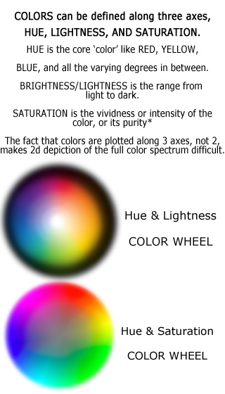
A SET OF COLORS SHOULD HAVE CONTRAST WITH EACH OTHER, and should follow the rule described on the composition page.
Common color schemes in art works include: [NO
HUE] - Black and white photography, basic pencil drawings, etc, focus
on the range of black, white, and intermediate grays and eschew hue and
saturation entirely. [MONOCHROME OR ANALOGOUS] - a limited color or
range of colors on one area of the color wheel. The artist
compensates for limited hue range with emphasis on lightness and
saturation contrast. [COMPLEMENTARY OR DYADIC] - two core color
areas opposite each other on the color wheel, such as the orange &
teal mix commonly seen in films. [TRIADIC] - three evenly spaced color areas along the color wheel, for example yellow-green/reddish-orange/bluish-purple. [SPLIT COMPLEMENT] - a limited color range on one side, a broader range opposite of it.
Often
a complex color scheme with many hues and variations on those hues, is
more notable for what ranges of color it excludes and minimizes, than
what it includes or emphasizes.
Usually once you have your basic
hue color scheme you can create added variants - ranges of saturation
and brightness within your range of hues, and [tiny amounts] of hue
that doesn't fit into the color scheme of the rest of the image, which
seems like a violation of the rule, but is in some cases a great way to
make that particular spot stand out as a focal point.
Note also
that colors do have psychological effects (warm energizes people, cool
calms them) and that color can be additive or subtractive in different
cases. All the hues of light combine to form white, but adding
all hues of paint together will end up with something like a dark gray
or black.